
Early detection of liver cancer is critical for improving patient outcomes, yet identifying at-risk individuals from routine clinical and lifestyle data remains a challenge. As such, determining “at risk” patients is an imperfect practice which remains more of an art than a science in hospitals and clinics around the world, especially considering that healthcare providers have many demands on their time and attention during the course of their day.
In this project, I have used a synthetic medical dataset to build a predictive model that classifies patients based on the likelihood of developing liver cancer. By applying logistic regression, a fundamental yet powerful machine learning algorithm, I explore how various health indicators, such as age, BMI, hepatitis history, alcohol use, and liver function scores, contribute to cancer risk.
Alongside accuracy, model performance was evaluated using Receiver Operating Characteristic (ROC) curves and Area Under Curve (AUC) scores to ensure reliable classification, even in the presence of class imbalance, i.e. the model makes predictions even from messy data. This project demonstrates how interpretable, data-driven models can support medical decision-making and risk stratification.
Imports
Here are all of the python packages used in this project.
import pandas as pd
import matplotlib.pyplot as plt
import seaborn as sns
import warnings
from sklearn.preprocessing import StandardScaler
from sklearn.model_selection import train_test_split
from sklearn.linear_model import LogisticRegression
from sklearn.metrics import classification_report, confusion_matrix, roc_auc_score, roc_curve
warnings.filterwarnings("ignore")
Exploratory Data Analysis (EDA)
Data Loading, Processing, and Overview
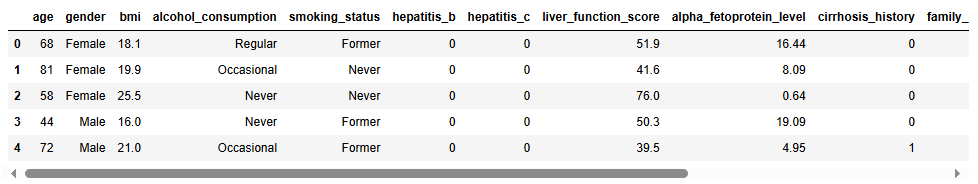
First I will load the file and perform visual inspection of the data.
df = pd.read_csv('C:/Users/misul/data/liver/synthetic_liver_cancer_dataset.csv')
df.head()
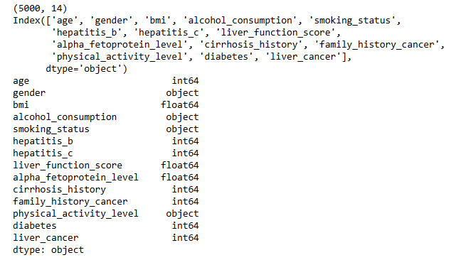
Next I will inspect the shape the dataset, what fields or columns are present, and what data types are present in each of those fields. The following output tells us that the dataset has 5,000 entries with 14 different fields. Those 14 fields are a combination of integers (whole numbers), floats (decimal numbers), and objects (categorical variables).
print(df.shape)
print(df.columns)
print(df.dtypes)
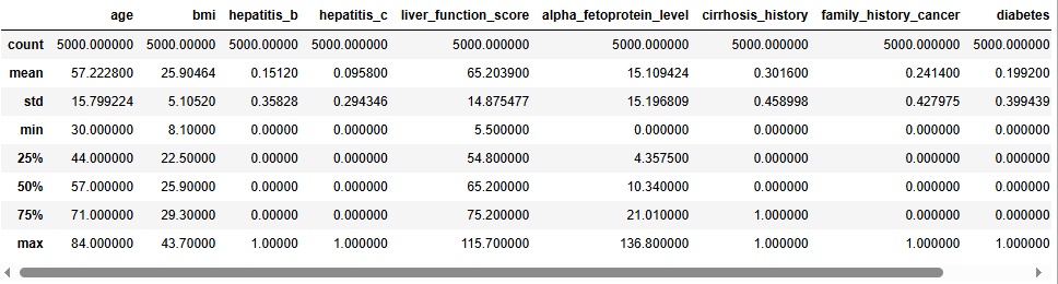
For the numerical fields in the data, let’s take a look at some summary statistics for each.
Now I want to see if we are missing any information in this file. Often data are messy and if we don’t have all of the information we need, we will have to decide how to handle that, as maintaining data quality is always important. Fortunately, this dataset is fairly clean and doesn’t have any empty fields.
df.isnull().sum()

Data Visualization
1. Liver Cancer
The first variable I want to look at is our target variable, which is the “liver_cancer” field. This field will be used for model training, testing, and prediction evaluation. As such, it is important for us to have a large enough sample from patients that both do and do not have liver cancer so we can build a quality model. As seen below, with over a thousand positive cases, we should be in good shape.
colors = ['purple', 'lightgreen']
plt.rcParams['figure.figsize'] = (20, 10)
sns.set(font_scale=2)

# Step 1: Calculate counts and percentages
counts = df['liver_cancer'].value_counts().sort_index()
percentages = counts / counts.sum() * 100

# Step 2: Prepare data for plotting
plot_data = pd.DataFrame({
    'liver_cancer': counts.index,
    'count': counts.values,
    'percent': percentages.values
})

# Step 3: Plot the barplot
ax = sns.barplot(data=plot_data, x='liver_cancer', y='count', palette=colors)
ax.set(title='Target Variable Distribution', xlabel='Values in "liver_cancer" Field', ylabel='Count')
plt.xticks([0, 1], ['0 (Negative)', '1 (Positive)'])

# Step 4: Annotate bars
for i, row in plot_data.iterrows():
    ax.text(
        i,
        row['count'] + 1,  # Adjust vertical position
        f"{int(row['count'])} ({row['percent']:.1f}%)",
        ha='center',
        va='bottom',
        fontsize=16
    )

plt.show()

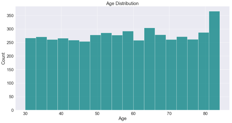
2. Age
ax = sns.histplot(df['age'], color='teal')
plt.title('Age Distribution')
plt.xlabel(xlabel='Age')
plt.show()
3. Body Mass Index (BMI)
sns.histplot(df['bmi'], kde=True, color='blue')
plt.title('BMI Distribution')
plt.xlabel('BMI')
plt.show()

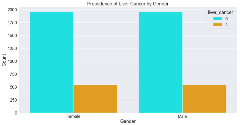
4. Gender
colors2 = ['cyan', 'orange']
sns.countplot(data=df, x='gender', hue='liver_cancer', palette=colors2)
plt.title('Precedence of Liver Cancer by Gender')
plt.xlabel('Gender')
plt.ylabel('Count')
plt.show()
5. Alcohol Consumption
sns.countplot(data=df, x='alcohol_consumption', palette='Set1')
plt.title('Alcohol Consumption')
plt.xlabel('Alcohol Consumption')
plt.ylabel('Count')
plt.show()

6. Smoking Status
df['smoking_status'].value_counts().plot(kind='bar', color='gold')
plt.title('Smoking Status Distribution')
plt.xticks(rotation=0)
plt.xlabel('Smoking Status')
plt.ylabel('Count')
plt.show()

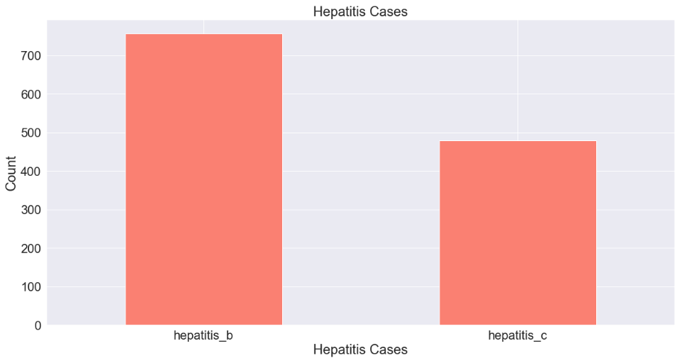
7. Hepatitis Cases
df[['hepatitis_b', 'hepatitis_c']].sum().plot(kind='bar', color='Salmon')
plt.title('Hepatitis Cases')
plt.xticks(rotation=0)
plt.xlabel('Hepatitis Cases')
plt.ylabel('Count')
plt.show()
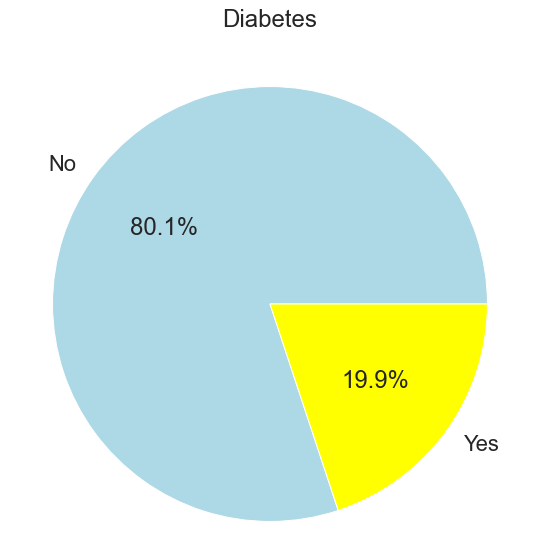
8. Diabetes
df['diabetes'].value_counts().plot.pie(autopct='%1.1f%%', labels=['No', 'Yes'], colors=['lightblue','yellow'])
plt.title('Diabetes')
plt.ylabel('')
plt.show()
9. Cirrhosis
df['cirrhosis_history'].value_counts().plot.pie(autopct='%1.1f%%', labels=['No', 'Yes'], colors=['darkred','silver'])
plt.title('Cirrhosis History')
plt.ylabel('')
plt.show()

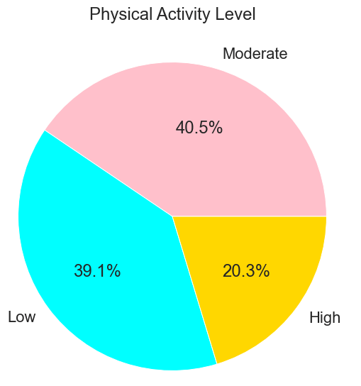
10. Physical Activity
df['physical_activity_level'].value_counts().plot(kind='pie', autopct='%1.1f%%', colors=['pink', 'cyan', 'gold'])
plt.title('Physical Activity Level')
plt.ylabel('')
plt.show()
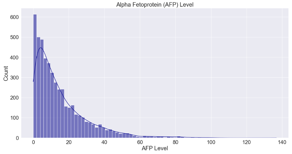
11. Alpha Fetoprotein (AFP) Level
sns.histplot(df['alpha_fetoprotein_level'], kde=True, color='darkblue')
plt.title('Alpha Fetoprotein (AFP) Level')
plt.xlabel('AFP Level')
plt.show()
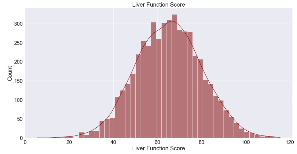
12. Liver Function Score
sns.histplot(df['liver_function_score'], kde=True, color='maroon')
plt.title('Liver Function Score')
plt.xlabel('Liver Function Score')
plt.ylabel('Count')
plt.show()
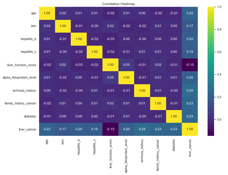
Identifying Correlations
Now that we have a good feel for the data for our exploration so far, we can begin to look for correlations. The machine learning package we will be using (Scikit-Learn) will do this for us but it is always good to drill a little deeper to understand what our tools are doing under the hood. We’ll use a correlation heat map to do this for the numerical data fields.
sns.set(font_scale=1)
plt.figure(figsize=(12,8))
sns.heatmap(df.corr(numeric_only=True), annot=True, cmap='viridis', fmt='.2f')
plt.title('Correlation Heatmap')
plt.show()
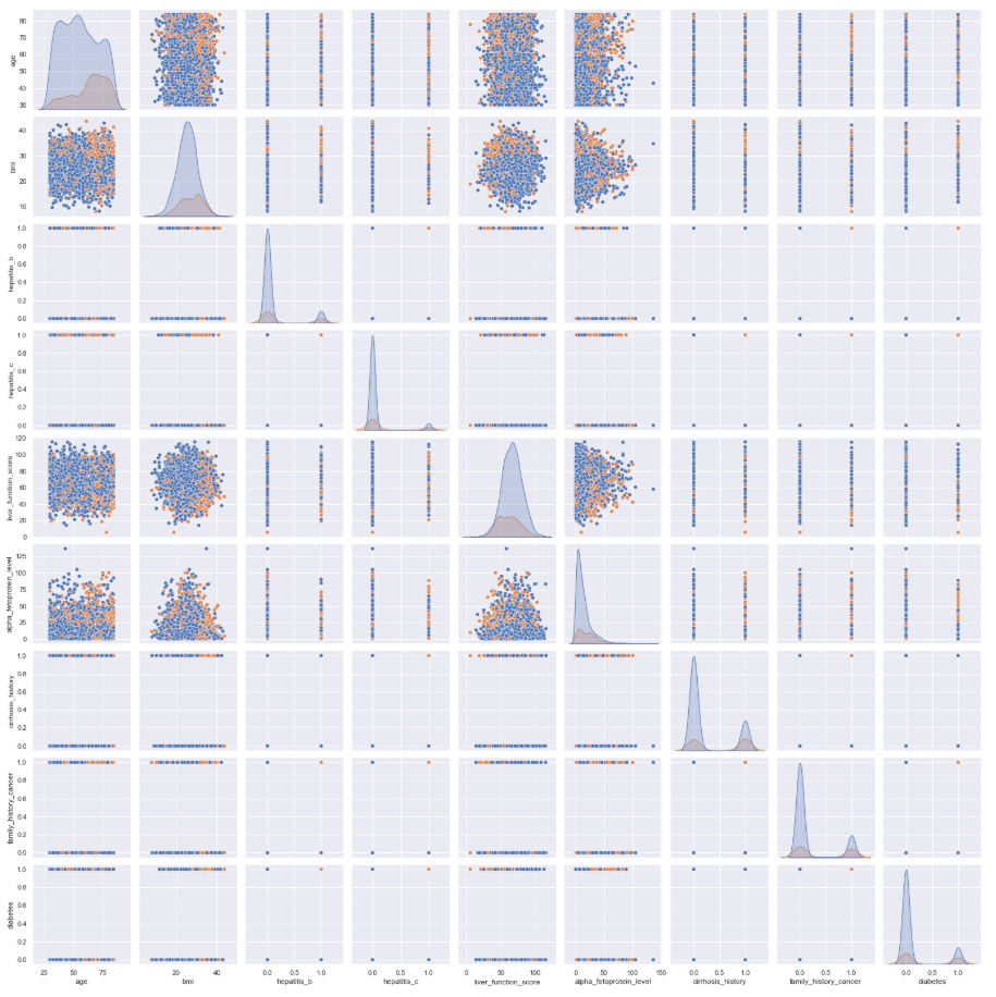
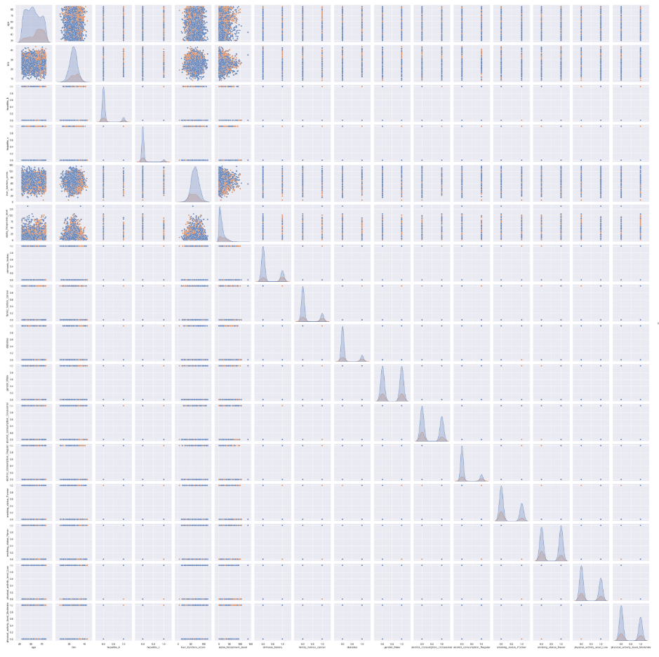
We can also create a pair plot to inspect how the numerical variables relate to each other. Although it is difficult to see the detail in this graphic with this many variables, this is generally a good step to include during feature selection before creating a machine learning model.
sns.pairplot(df[['age', 'bmi', 'hepatitis_b', 'hepatitis_c', 'liver_function_score', 'alpha_fetoprotein_level', 'cirrhosis_history', 'family_history_cancer', 'diabetes', 'liver_cancer']], hue='liver_cancer')
plt.show()
One-Hot Encoding
This is certainly a good start, but our dataset gave us a lot of richness in the form of categorical and/or non-numerical data. We want to include all of those fields in our hunt for correlations, as well. To do that, we perform what is called “One-Hot Encoding”. Essentially, this is the process of converting non-numerical values into numerical values in a way that preserves their ability to represent correlations so we can do computations with them. Here’s how we will do that:
# Convert categorical variables using one-hot encoding
df = pd.get_dummies(df, drop_first=True)
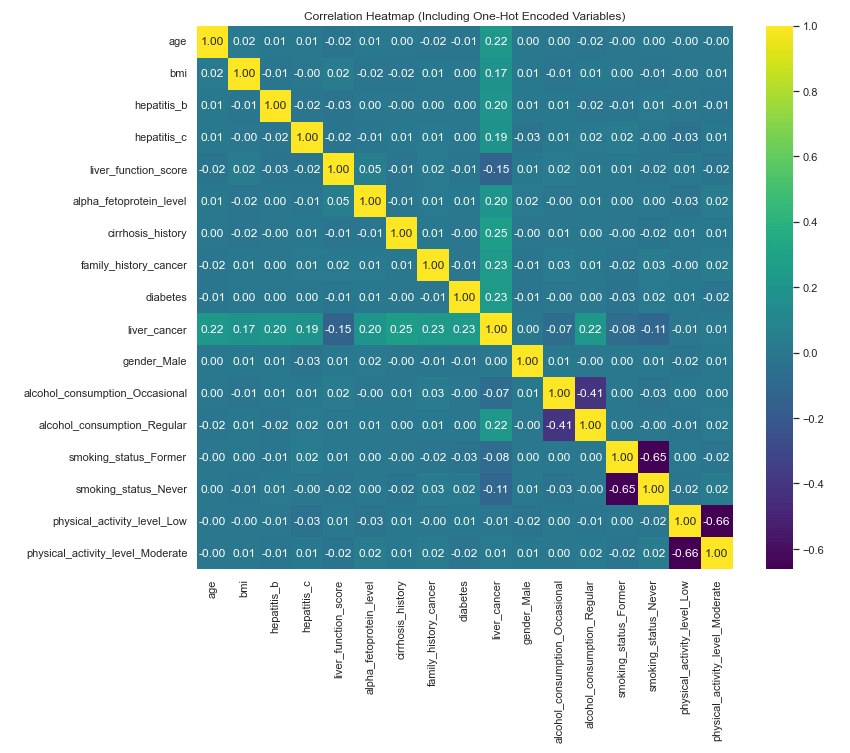
Now let’s rerun the correlation heat map and pair plot with the one-hot encoded fields added in. Note: it is easier to see all of the detail in the actual python output (in my case, Jupyter Notebook).
corr = df.corr()
plt.figure(figsize=(12, 10))
sns.heatmap(corr, annot=True, fmt=".2f", cmap="viridis")
plt.title("Correlation Heatmap (Including One-Hot Encoded Variables)")
plt.show()
sns.pairplot(df, hue='liver_cancer')
plt.show()
Training the Logistic Regression Model
Perhaps the first step in running logic regression is the one-hot encoding, but as that step is also useful for data visualization, we have already completed it. The next step is to separate the target variable from the rest of the data fields.
X = df.drop('liver_cancer', axis=1)
y = df['liver_cancer']
Next is feature scaling. A logistic regression algorithm uses a mathematical process called “gradient descent” to optimize the cost function. (I’m intentionally not explaining this with much detail here. Perhaps I will cover the more detailed parts at a later time.) If the features are on much different scales, this process will likely be inefficient, taking a long time to compute, and may result in sub-optimal model learning and predictive power. Feature scaling solves this problem by reducing the scale of all of the data and ensuring that all features contribute equally to the learning process.
scaler = StandardScaler()
X_scaled = scaler.fit_transform(X)
The next step is to further separate the data into four data frames. These will separately contain: target variable (liver cancer) for training, the rest of the data for training, target variable for testing, and the rest of the data for testing. The code defines that 20% of the data will be used from testing. This is a reasonable balance between having a large amount of data to train the model and also having a fair amount to test with to ensure the test sample is also representative of the whole dataset.
X_train, X_test, y_train, y_test = train_test_split(
    X_scaled, y, test_size=0.2, random_state=42, stratify=y)
The next step is to actually train the model.
model = LogisticRegression()
model.fit(X_train, y_train)
Testing and Assessing Model Performance
Now we will test the model by running predictions against the test data and we will print about some quality data about the performance of the model.
y_pred = model.predict(X_test)
y_prob = model.predict_proba(X_test)[:, 1]
cm = confusion_matrix(y_test, y_pred)
report = classification_report(y_test, y_pred)

print(cm)
print(report)
print("ROC AUC:", roc_auc_score(y_test, y_prob))

The confusion matrix tells us there were 748 True Negatives, 34 False Negatives, 50 True Positives, and 168 False Positives in the predictions. This gives our model an overall accuracy rating of 92%. Let’s visualize these results using a heat map.
# Define class labels
labels = ['No Liver Cancer', 'Liver Cancer']

# Plot using seaborn heatmap
plt.figure(figsize=(6, 5))
sns.heatmap(cm, annot=True, fmt='d', cmap='Blues',
            xticklabels=labels, yticklabels=labels)

plt.xlabel('Predicted Label')
plt.ylabel('True Label')
plt.title('Confusion Matrix')
plt.show()

While we’re at it, let’s go ahead and create a heat map for the classification report, as well.
# Generate classification report as a dictionary
report = classification_report(y_test, y_pred, output_dict=True)

# Convert to DataFrame
report_df = pd.DataFrame(report).transpose()

# Plot heatmap
plt.figure(figsize=(8, 5))
sns.heatmap(report_df.iloc[:, :3], annot=True, cmap="YlGnBu", fmt=".2f")
plt.title("Classification Report")
plt.show()
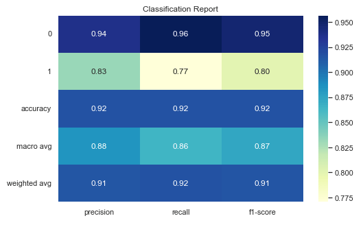
Here’s a quick reference for what each of the fields in the Classification Report are.
| Classification Report Field | Description |
|---|---|
| 0 | Original data label. 0 = No liver cancer |
| 1 | Original data label. 1 = liver cancer |
| Accuracy | Overall fraction of correct predictions |
| Macro Avg | Unweighted average of precision, recall, and F1-score across all classes |
| Weighted Avg | Average of metrics weighted by support (i.e., frequency of positives and negatives) |
| Precision | Out of all the times the model predicted this class, how many were correct? |
| Recall | Out of all actual cases of this class, how many did the model catch? |
| F1-Score | Harmonic mean of precision and recall. Essentially a balance these two metrics. |
Next let’s produce a Receiver Operating Characteristic (ROC) curve to assess how well the model separates positive and negative results across the various thresholds.
fpr, tpr, thresholds = roc_curve(y_test, y_prob)

plt.figure()
plt.plot(fpr, tpr, label='Logistic Regression (AUC = 0.967)')
plt.plot([0, 1], [0, 1], linestyle='--')
plt.xlabel('False Positive Rate')
plt.ylabel('True Positive Rate')
plt.title('Receiver Operating Characteristic')
plt.legend()
plt.show()
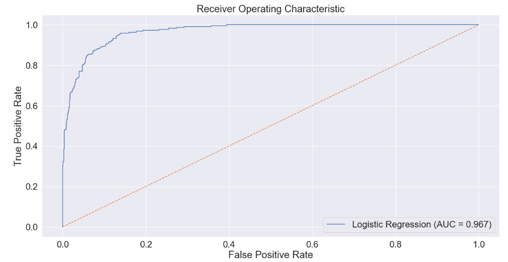
The Area Under the ROC Curve (AUC) score represents this performance in distinguishing between positives and negatives as a single number. A score of 1.0 means a model is perfect, whereas a score of 0.5 means a model is no better than chance. At an AUC score of nearly 0.97, we can assess that our model is very good and would likely add a lot of value in a context in which the input data are regularly available and with quality similar to the data in this dataset.
Conclusion
The logistic regression model provides a solid baseline for binary classification of liver cancer presence in this dataset. While the accuracy score gives a quick snapshot of overall performance, it can be misleading due to the class imbalance (with a majority of non-cancer cases). This is why the ROC curve and AUC score are especially valuable, as they offer a threshold-independent evaluation by showing how well the model distinguishes between the two classes across all probability thresholds. A high AUC suggests strong discriminatory power even if the accuracy appears inflated or deflated by class imbalance. Additional metrics such as precision, recall, and F1-score are also important: precision indicates how many predicted positives are truly positive, recall shows how well the model captures actual positive cases, and F1 balances the two. Together, these metrics help evaluate the trade-offs between false positives and false negatives, an especially critical concern in medical screening contexts like liver cancer prediction, where missing a positive case could have serious consequences.
Overall, I believe this is a high-quality logistic regression model that could be useful identifying “at risk” patients within a context where all of these input data are regularly available in a hospital or clinical setting.

Leave a comment